AQUA
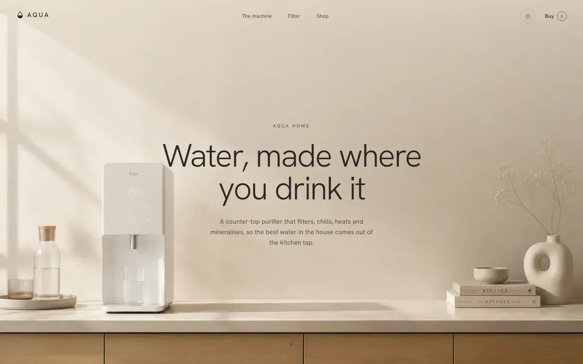
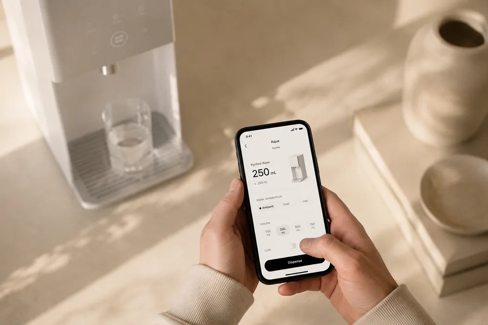
Every water purifier on the market is photographed in blue light on a white counter. AQUA is the argument that a filter belongs in a kitchen, and kitchens are warm.
- Category
- Home & appliance
- Year
- 2026
- Scope
- 4 workstreams
- Brand identity
- Product photography direction
- Website
- Light/dark system
- Next.js
- TypeScript
- Tailwind CSS
- Vercel
The category convention is medical: cool blues, chrome, droplet icons and language about purity. It sells the anxiety rather than the object. AQUA wanted the opposite: an appliance you would leave out on the counter.
That meant the palette had to come from the room rather than from the product category, so every value in the system was sampled from the photography: linen, sand, clay and an espresso ink, with one honey accent.
Four decisions the whole project rests on.
- 01
A palette sampled, not chosen
Six values taken directly off the shoot, then tested against each other for contrast at body-copy size before anything was designed with them.
- 02
Light and dark, both warm
The dark scheme is not the light one inverted; it is the same room at night. The accent is the only value that holds identically across both.
- 03
A mark that survives an appliance
Drawn as a component and shipped as a static SVG twin, so it can be etched, printed or embossed on the product without going back to a designer.
- 04
Photography as the layout
The page is built around full-bleed frames with copy set into their quiet corners, rather than photographs dropped into boxes.
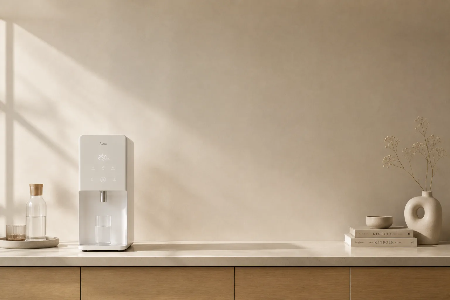
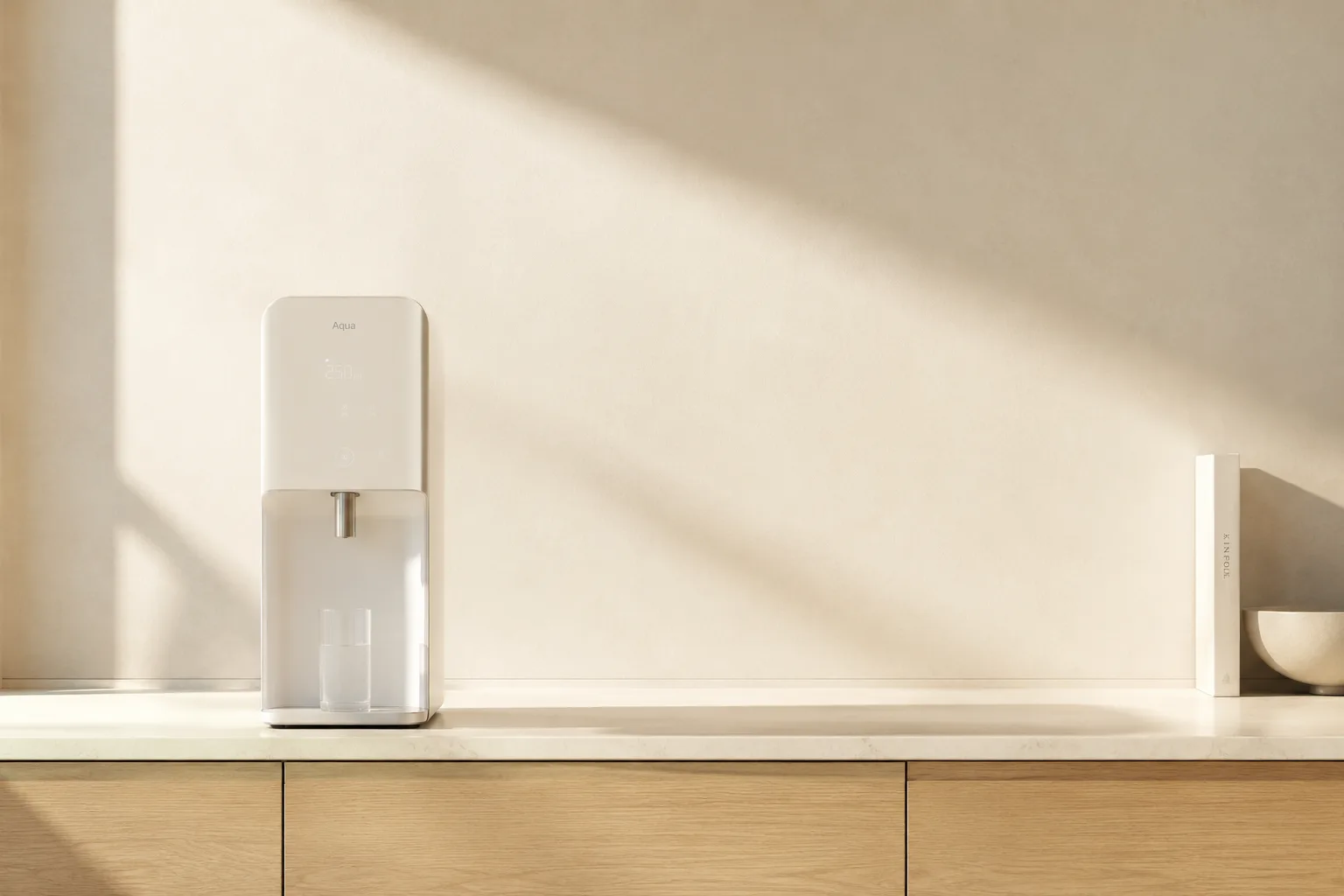
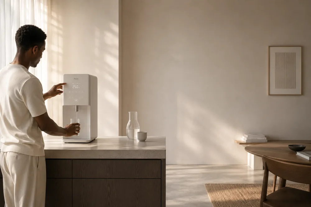
The imagery the brand was built on.
Every frame here was produced for this project, and the colour on this page comes out of these, not the other way round.
Where it landed.
AQUA reads as furniture rather than as equipment, which is the entire commercial argument for a product that costs three times the category average.
The light/dark switch writes to the wrapper and is applied before first paint, so a reader who picks a side never sees the other one flash.
- Values sampled off the shoot
- 06
- Colour schemes, both warm
- 02
- Blue anywhere in the system
- 0
What it taught usSampling the palette from the photography is why the site and the product look like the same company made them.
PULP
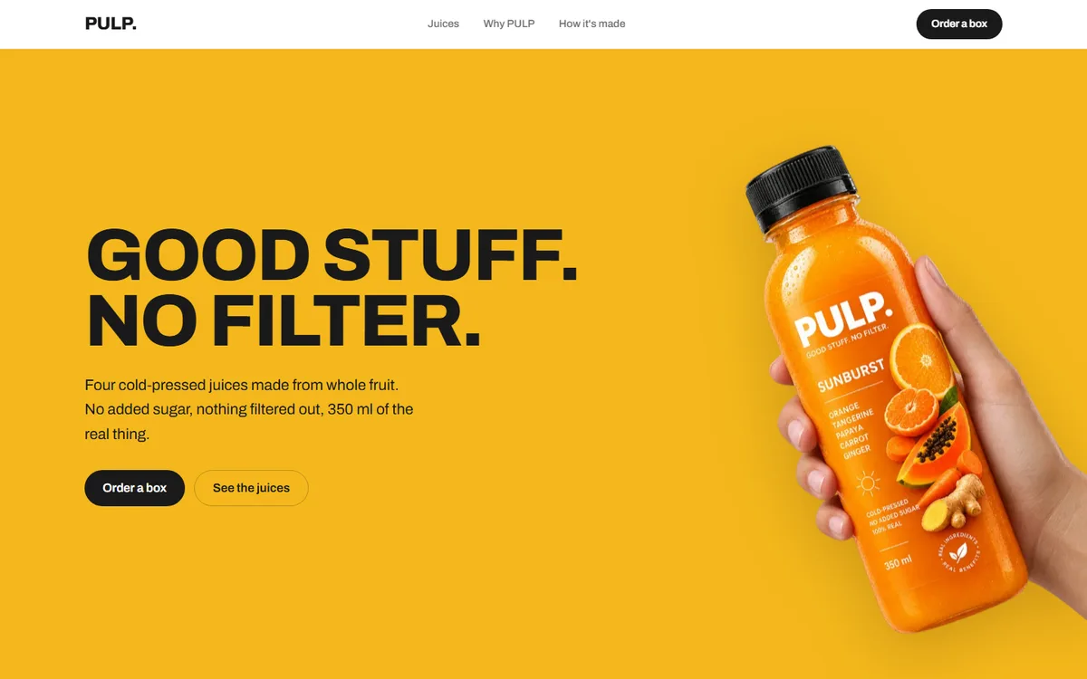
A juice brand with four flavours and no house colour. Each one takes the page over completely.
Food & drink2026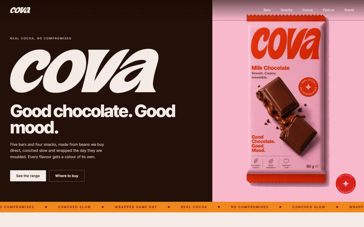
COVA
Four core browns plus a deep and soft pair per flavour, every hex sampled from the artwork rather than chosen beside it.
Food & drink2026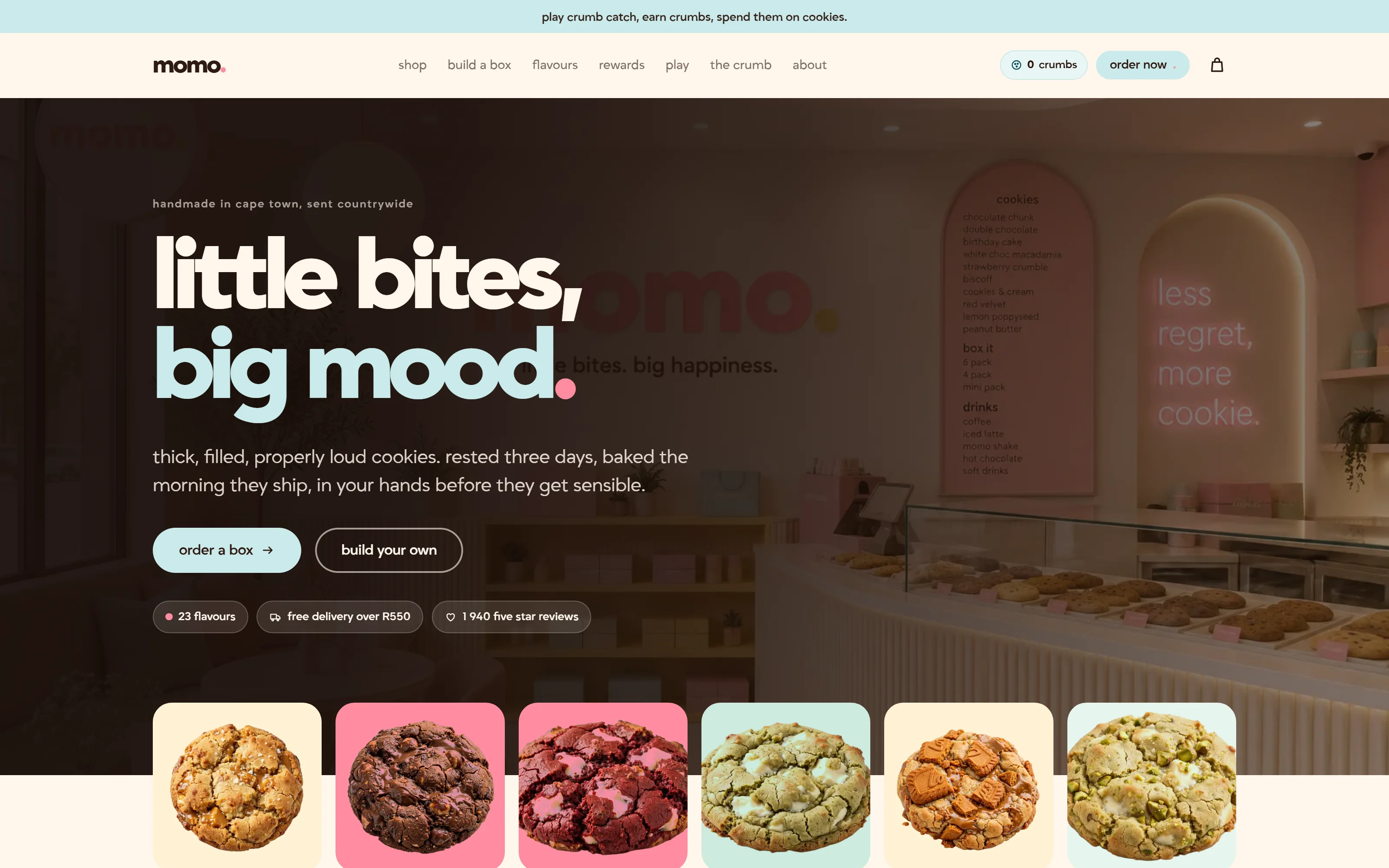
Momo
A Cape Town cookie bakery that ships nationwide. Twenty-three flavours, three colour themes, and a box you build yourself.
Food & drink2026
Start a project like this one.
Tell us what the business does and who it sells to. A fixed quote comes back inside two days.
- Office
- Sunninghill, Sandton, 2196
- Hours
- Mon–Fri, 07:00–17:00
- info@bonangtech.com