Graphic design & branding
A logo is the smallest part of an identity and the part everyone argues about. What matters is the system around it: the colour, the type, and the rules that keep the tenth thing you make looking like the first.
We start with where the brand actually appears (a signboard, an invoice, an Instagram square, a 32px favicon) and design for the hardest of those first. A mark that works at sixteen pixels works everywhere; the reverse is not true.
Colour is chosen with contrast measured rather than eyeballed, so the palette is still usable when it has to carry text on a website or a form. Type is licensed properly, in writing, including for web embedding. That is the single most common thing we find missing when a business brings us an existing brand.
Everything is handed over as a short guide rather than a long one: the marks, the palette in hex, RGB and CMYK, the type, the spacing rules, and three pages of what not to do. Long brand books do not get read.
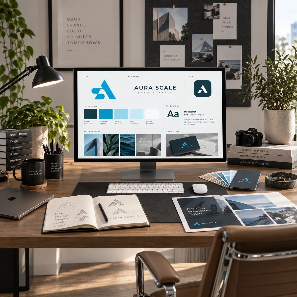
- Logo, palette, type and usage rules
- Every file format you will be asked for
- Templates for the things you print
Four things arrive, in this order.
Everything below is in the scope by default. If a project does not need one of them, it comes off the quote rather than being quietly left out.
- 01
The marks
Primary, secondary and a single-colour version, in SVG, PDF, PNG and ICO, in every colourway you will need.
- 02
A palette that measures up
Core and support colours with contrast ratios documented, so nobody has to guess whether text on it is legible.
- 03
Type and licensing
A primary and a secondary face, with the desktop, web and app licences in your name and the receipts to prove it.
- 04
Templates
Letterhead, invoice, email signature, business card and social artwork, editable in what your team already uses.
From the first call to the handover.
You see the work at every stage, on something real. Nothing on this list needs chasing.
- 01
Brief
What the business is, who it sells to, and what it must never be mistaken for.
- 02
Three directions
Genuinely different routes, each shown in situ rather than floating on white.
- 03
Refine one
Two rounds on the chosen route. We do not blend three directions into a fourth; that is how brands end up looking like nothing.
- 04
Systemise and hand over
The guide, the files, the templates and the licences, in one archive with a README.
The things people ask before they commit.
Do we own the logo?
Yes, in full, on final payment, including the working files. Type licences are bought in your name and transfer with the brand.
Can you refresh what we have rather than start over?
Often that is the better answer, and it is cheaper. We will say honestly which of the two your brand needs.
Do you do print production?
We supply print-ready artwork and will liaise with your printer on stock and finish, but we do not mark up printing.
Need graphic design & branding?
Send through what the business needs and a fixed quote comes back inside two days.
- Office
- Sunninghill, Sandton, 2196
- Hours
- Mon–Fri, 07:00–17:00
- info@bonangtech.com