PULP
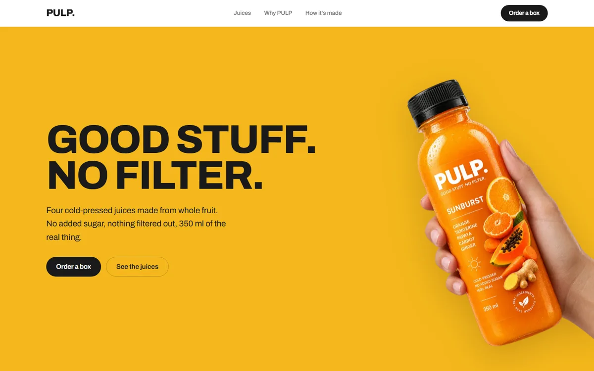
Four flavours, four colours, and a page that hands itself over to whichever one you are reading. The restraint is everywhere else: one grotesk, one weight of rule, and nothing on the page that is not a bottle or a sentence.
- Category
- Food & drink
- Year
- 2026
- Scope
- 5 workstreams
- Brand identity
- Packaging art direction
- Website
- Product pages
- Order flow
- Next.js
- TypeScript
- Tailwind CSS
- Vercel
- Resend
PULP came to us with a product and a name and very little else. Four cold-pressed juices, sold direct, with the fruit doing the arguing. The risk in a brand like this is obvious: four loud colours, used badly, reads as a children's brand rather than as something you would pay a premium for.
The decision that shaped everything: PULP has no single house colour. Each juice owns a flat field, and any page about that juice is printed on it. The identity is not the colour, it is the discipline around the colour.
Four decisions the whole project rests on.
- 01
One colour at a time
Every hex was sampled from the fruit itself rather than picked beside it, then held to a contrast floor so the type on it never drops below 4.5:1. A field is something type sits on; it is never the type.
- 02
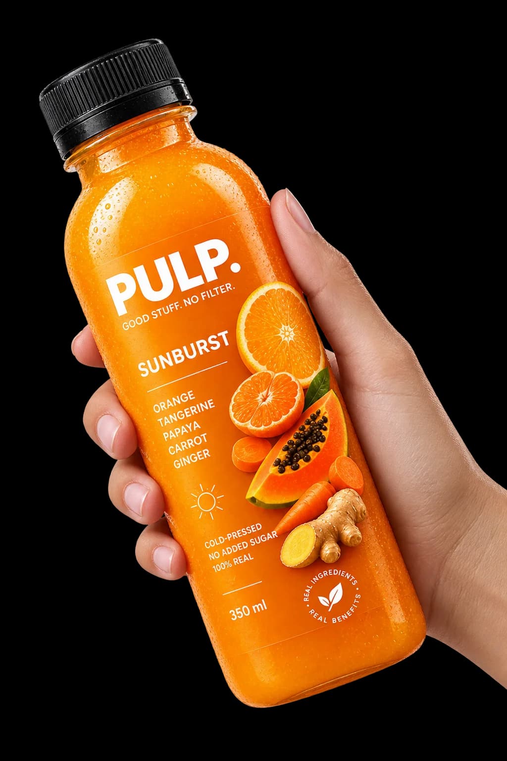
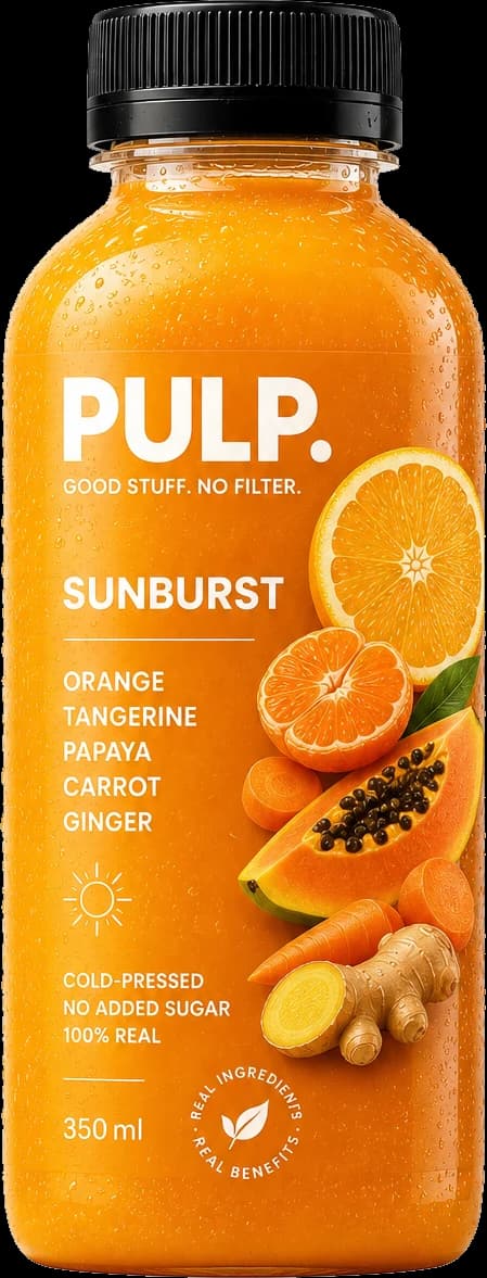
Bottles as cut-outs, not crops
The product photography is keyed off its studio ground so a bottle can be laid on any of the four colours at any size, rather than boxed into a frame that fights the field behind it.
- 03
A page per juice
Each flavour has its own route with its own ground, its own pattern and its own story, so the range reads as four products rather than as one product in four wrappers.
- 04
An order form that is honest
A short form, server-side validation, and a real confirmation email. No cart, no accounts, no checkout theatre for a business selling four things.
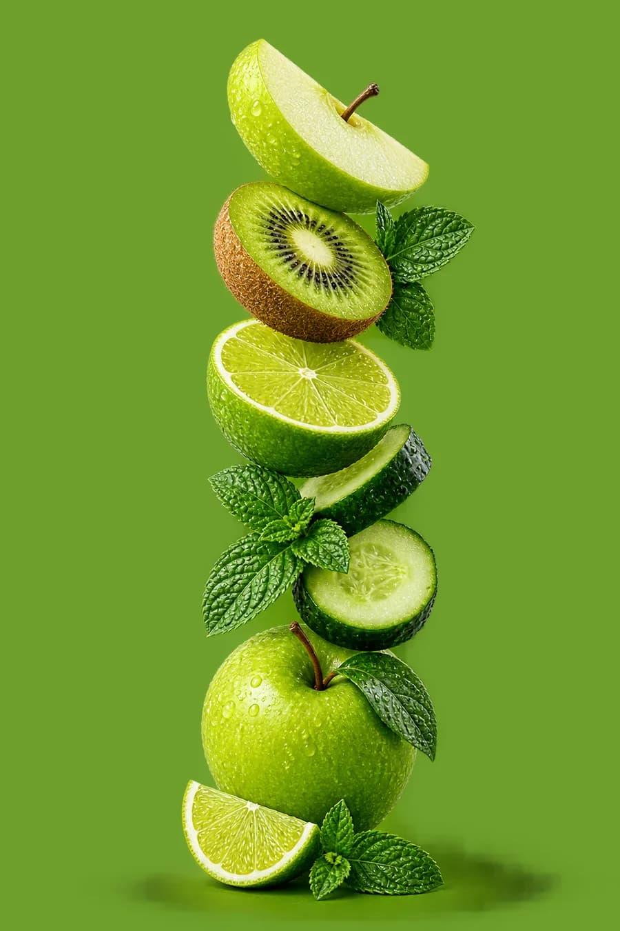
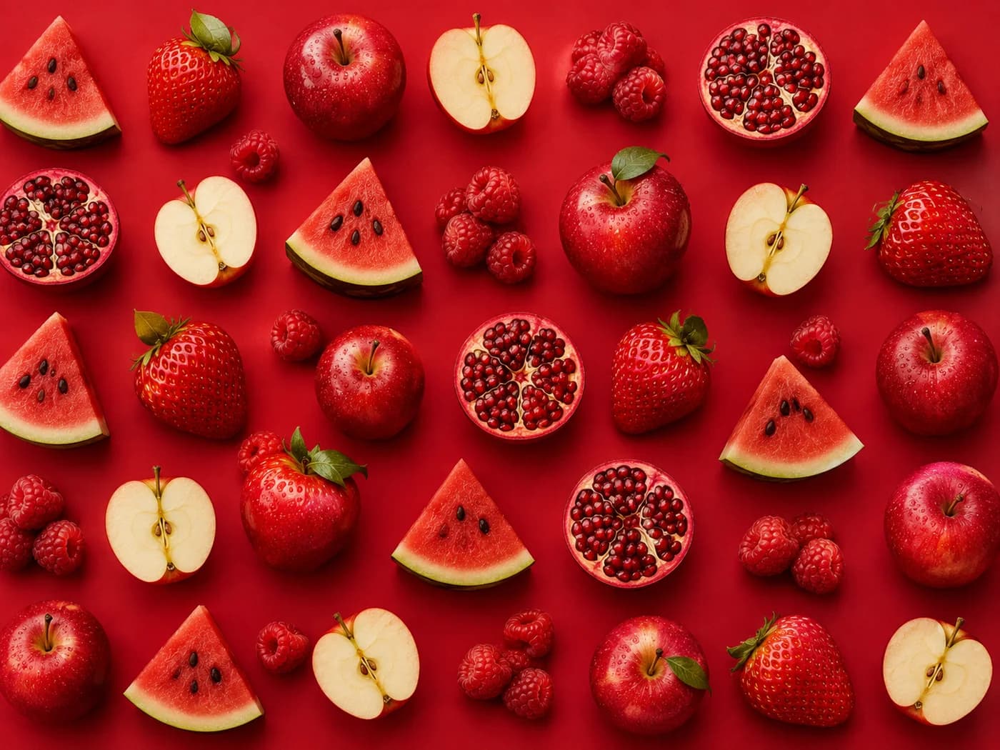
The imagery the brand was built on.
Every frame here was produced for this project, and the colour on this page comes out of these, not the other way round.
Where it landed.
The result is a site that changes completely between routes without ever changing typeface, spacing or rhythm, which is what makes four unrelated colours read as one brand.
The order flow ships as a server action with email confirmation, so the whole thing runs on static hosting with no backend to maintain.
- Flavours, each with its own page
- 04
- Lighthouse performance at launch
- 99
- Backend services to maintain
- 0
What it taught usThe brand rule that made it work: colour is a ground, never a voice.
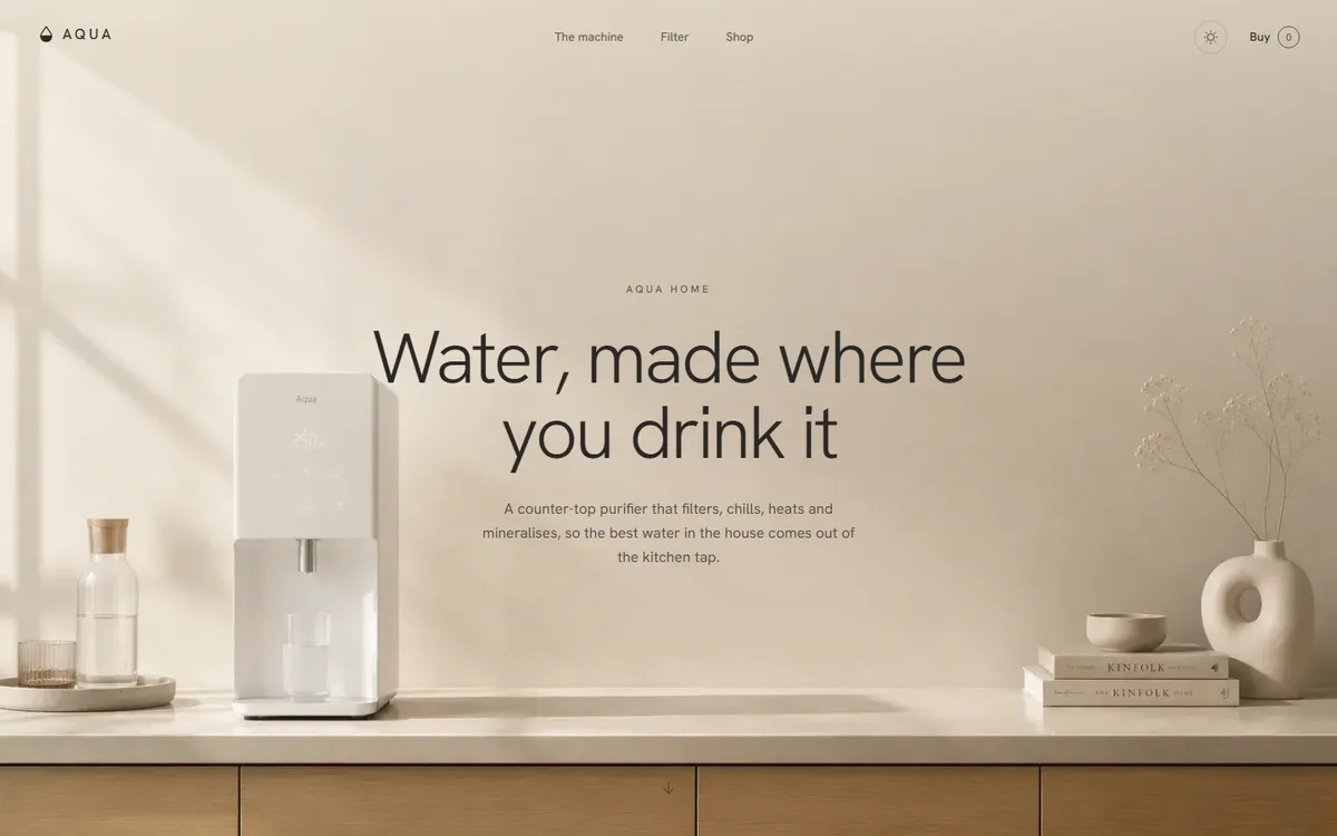
AQUA
A water product that refuses to look clinical: linen, sand and clay instead of the category's blue and chrome.
Home & appliance2026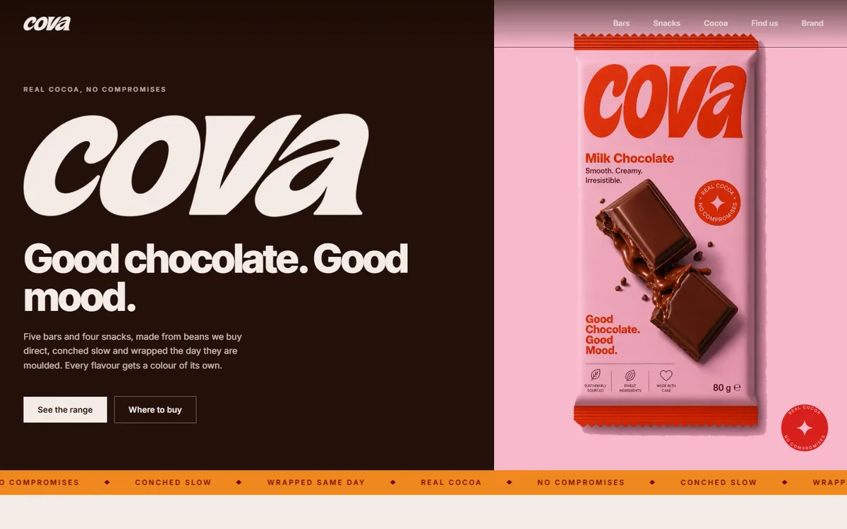
COVA
Four core browns plus a deep and soft pair per flavour, every hex sampled from the artwork rather than chosen beside it.
Food & drink2026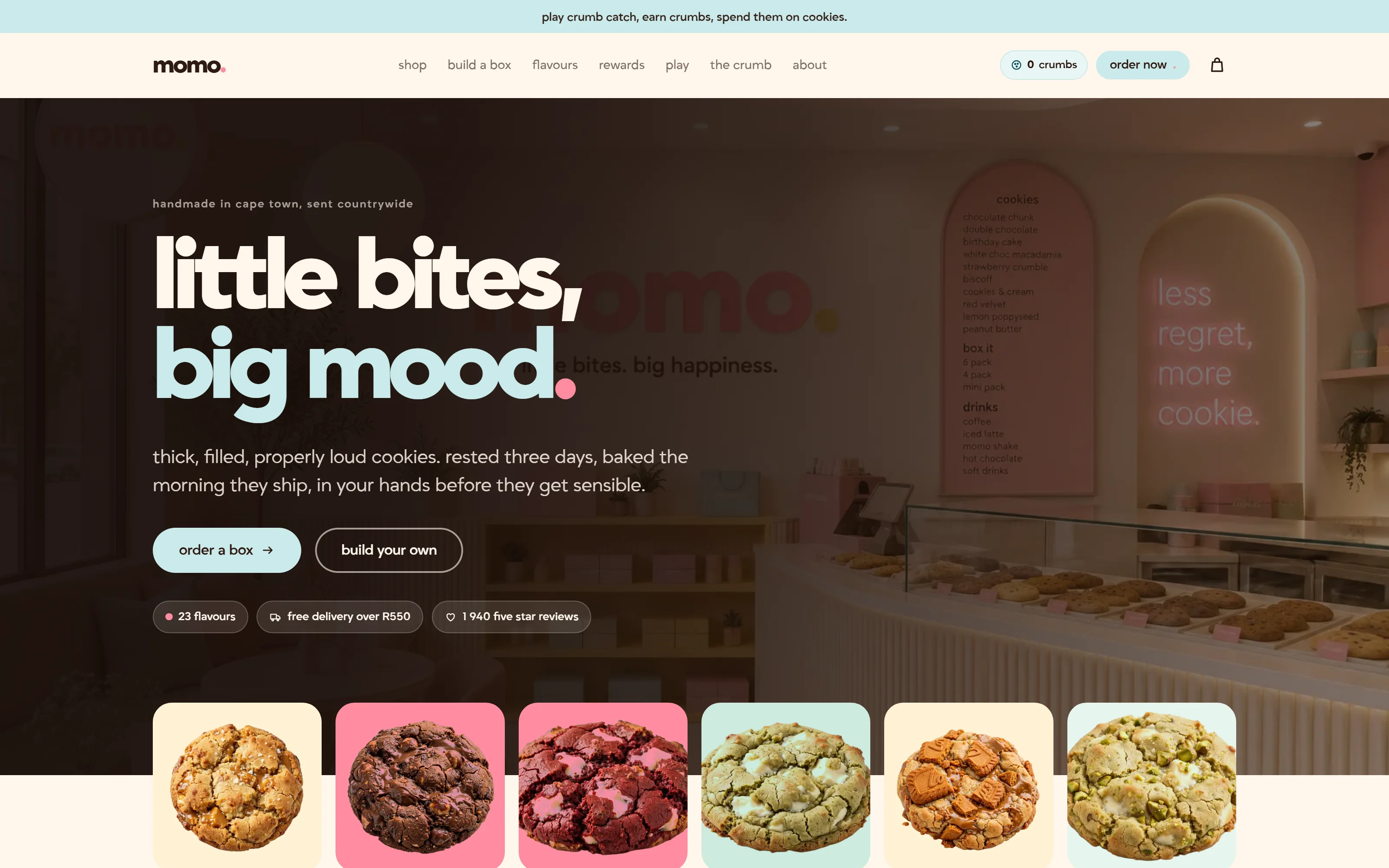
Momo
A Cape Town cookie bakery that ships nationwide. Twenty-three flavours, three colour themes, and a box you build yourself.
Food & drink2026
Start a project like this one.
Tell us what the business does and who it sells to. A fixed quote comes back inside two days.
- Office
- Sunninghill, Sandton, 2196
- Hours
- Mon–Fri, 07:00–17:00
- info@bonangtech.com