COVA
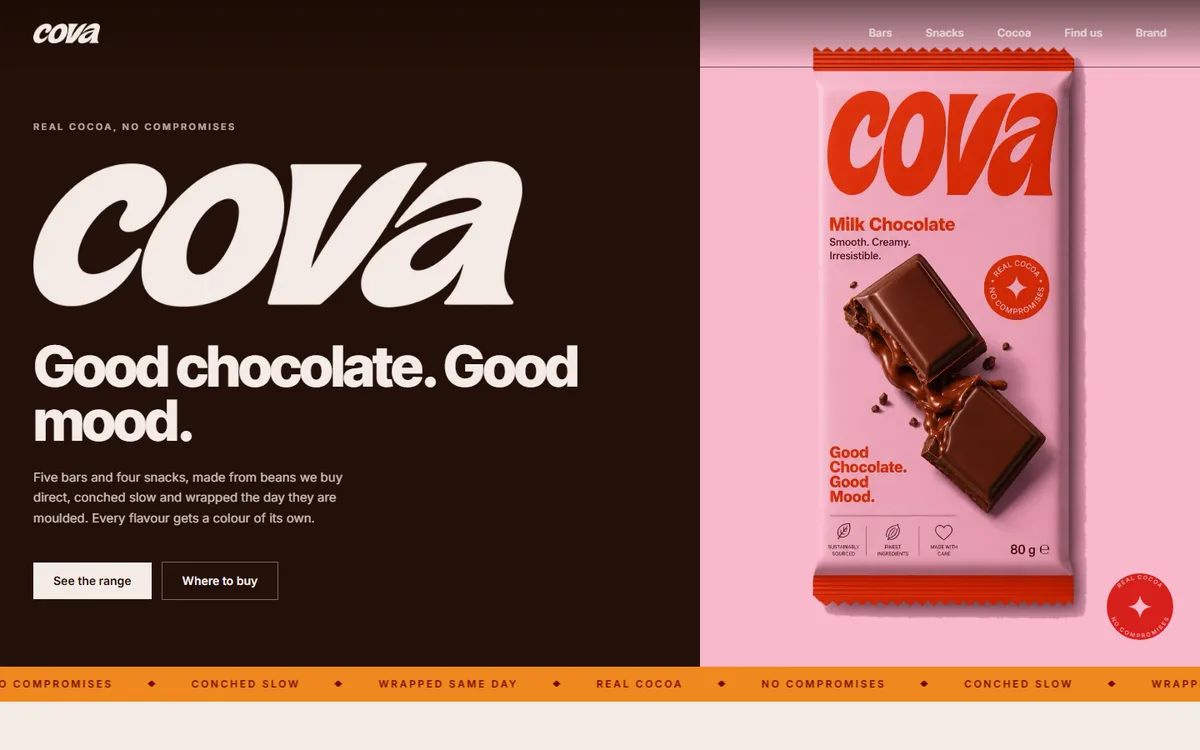
The packaging existed before the website did, which is the harder direction to work in. So nothing on the site was designed beside the packs; every value was read out of them.
- Category
- Food & drink
- Year
- 2026
- Scope
- 4 workstreams
- Brand system
- Packaging art direction
- Website
- Asset pipeline
- Next.js
- TypeScript
- Tailwind CSS
- Sharp
- Vercel
COVA had finished artwork for eight products and needed a site that did not look like a different company had made it. The usual failure here is a designer picking colours that sit near the packaging and calling it a match; up against the real thing, near is worse than wrong.
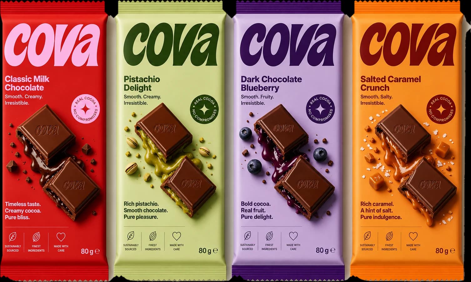
We built the palette by sampling: four core browns, then one deep and one soft value per flavour, taken straight from the printed artwork. Burnt was reserved for lettering on Amber, because it is the only pair in the set that measures.
Four decisions the whole project rests on.
- 01
An asset pipeline, not a folder
A script trims the drawn wordmark, resizes the photography, and keys the studio ground out of every pack shot, so re-shooting a product is one command rather than an afternoon.
- 02
Two keying modes
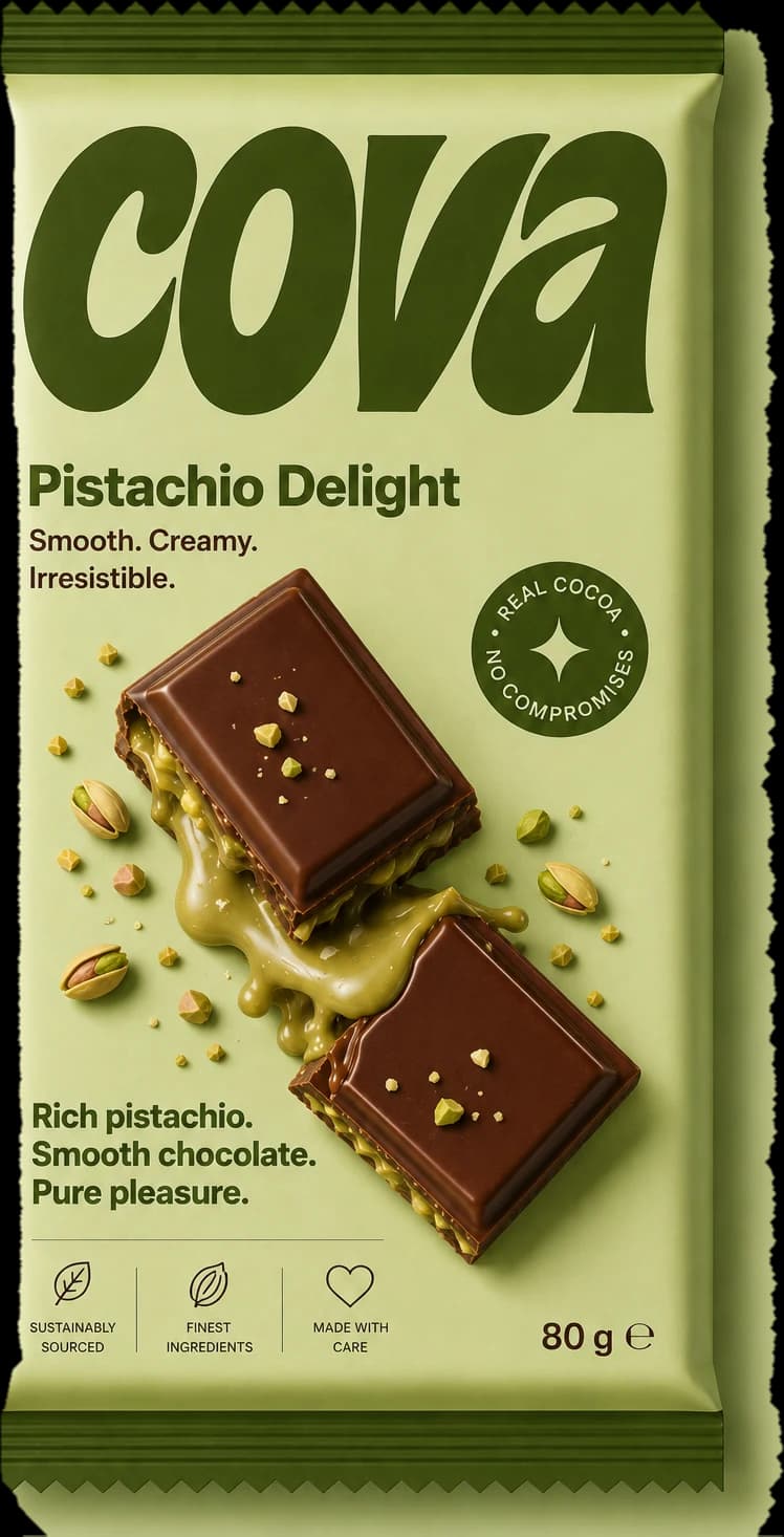
Bars are photographed on their own flavour colour, so the key leans on the drop shadow to find the wrapper edge; cream and white shots key on chroma instead, which takes the shadow with it.
- 03
Packs as objects
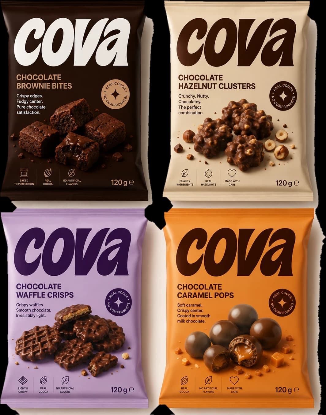
Every product is a cut-out laid on brand colour at whatever size the layout wants, rather than a rectangle cropped to fit a box.
- 04
A wordmark that prints in any colour
The drawn lettering is applied as a CSS mask over currentColor, so one file sets the name in all eleven brand values.
The imagery the brand was built on.
Every frame here was produced for this project, and the colour on this page comes out of these, not the other way round.
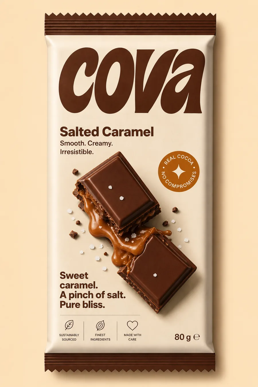
Where it landed.
The site and the shelf match exactly, because they are the same colours rather than similar ones.
The asset pipeline means the eleventh product costs what the first one did.
- Values sampled off the artwork
- 12
- Products cut out automatically
- 11
- Hand-edited image files
- 0
What it taught usWhen packaging exists first, sample it. Do not match it by eye.
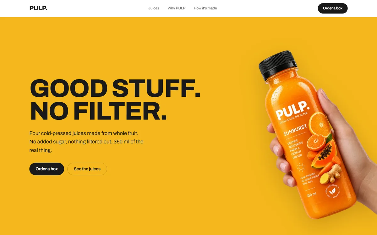
PULP
A juice brand with four flavours and no house colour. Each one takes the page over completely.
Food & drink2026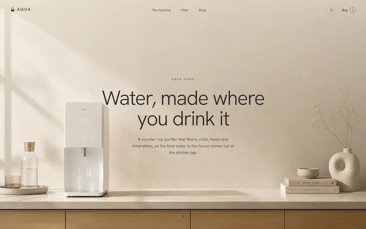
AQUA
A water product that refuses to look clinical: linen, sand and clay instead of the category's blue and chrome.
Home & appliance2026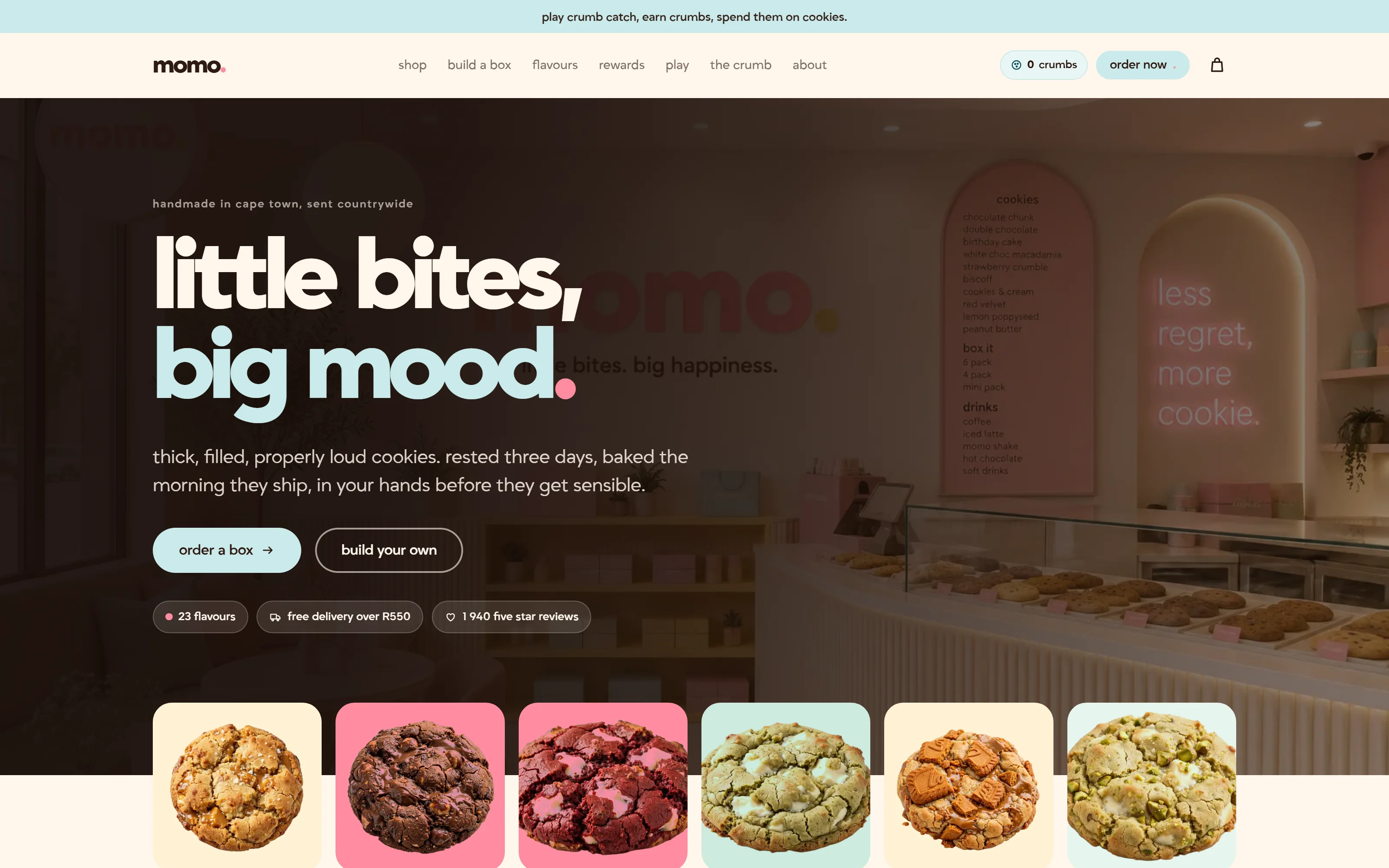
Momo
A Cape Town cookie bakery that ships nationwide. Twenty-three flavours, three colour themes, and a box you build yourself.
Food & drink2026
Start a project like this one.
Tell us what the business does and who it sells to. A fixed quote comes back inside two days.
- Office
- Sunninghill, Sandton, 2196
- Hours
- Mon–Fri, 07:00–17:00
- info@bonangtech.com