Luma Interiors
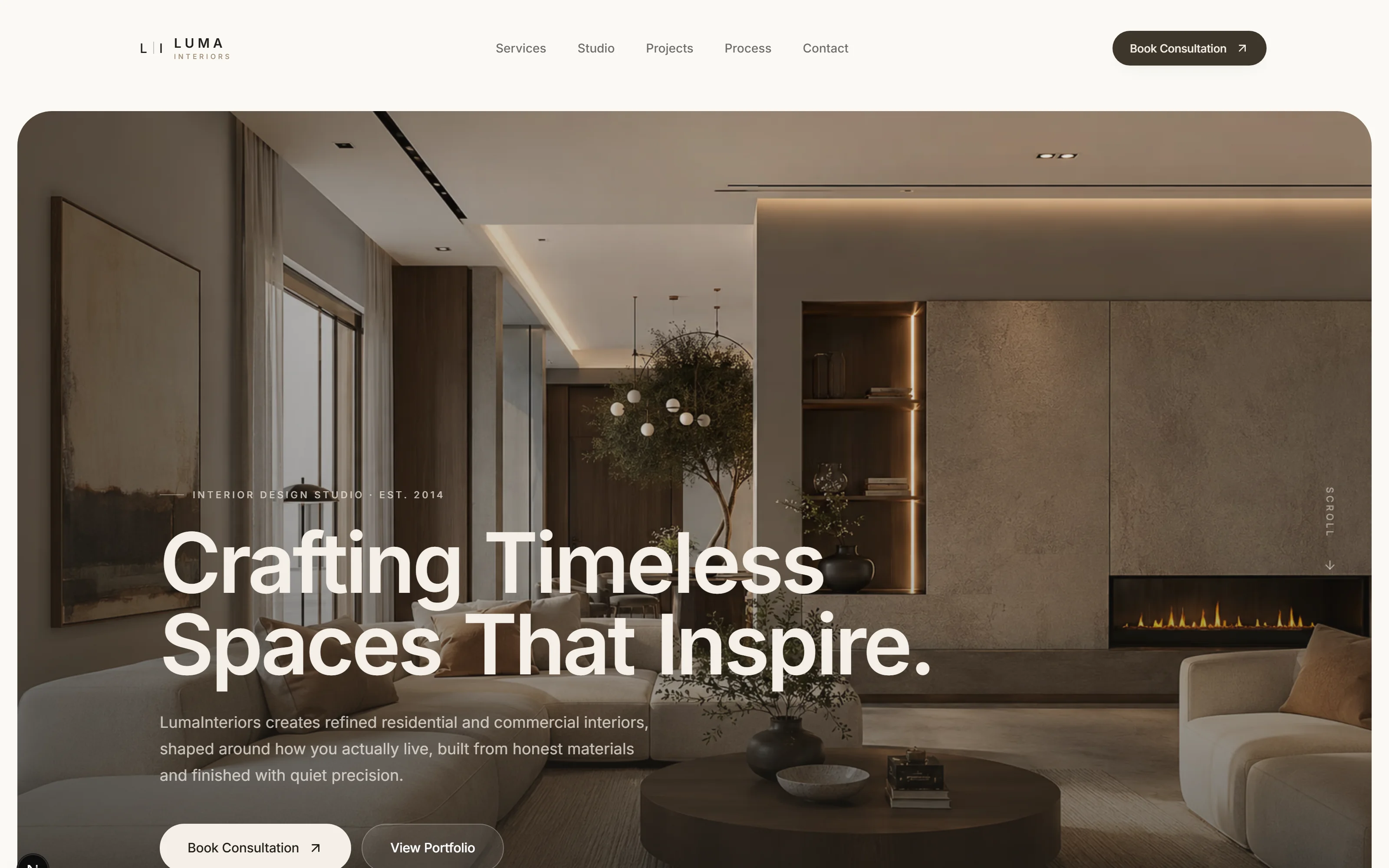
An interior studio is judged on restraint, so its website cannot be the loudest thing it has made. Every value on the page was taken from the rooms, and the type is set the way the studio sets a shelf: little on it, and all of it placed.
- Category
- Interior design
- Year
- 2026
- Scope
- 4 workstreams
- Brand identity
- Photography direction
- Website
- Consultation enquiry flow
- Next.js
- TypeScript
- Tailwind CSS
- Vercel
Luma Interiors designs high-end residential and commercial spaces from a studio in Sandton and had been working for over a decade on referral alone. The site had to do one thing: make someone who has just seen a finished room feel the same way about the studio before they pick up the phone.
The temptation with interiors is to let the photography do all of the work and hang a generic template around it. That is how most studio sites end up looking like each other. Here the page itself had to be an interior: the same materials, the same weight of line, the same amount of air.
Four decisions the whole project rests on.
- 01
A palette read out of the rooms
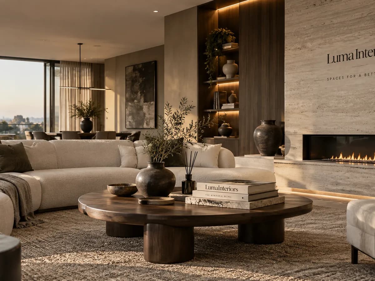
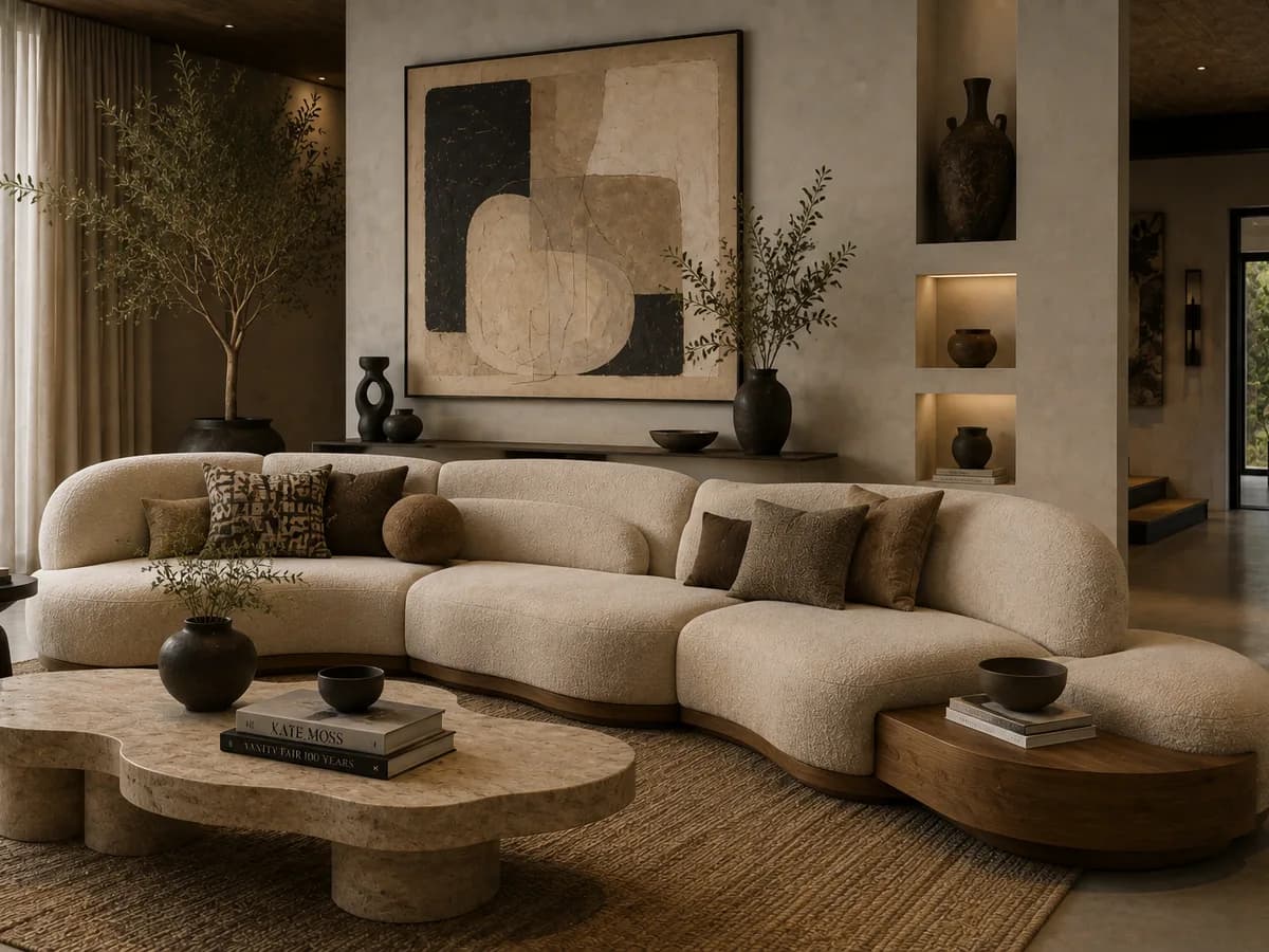
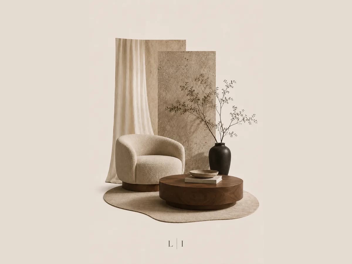
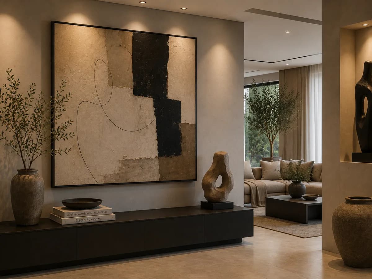
Ivory, cream, sand, beige, taupe, clay, umber, brass, espresso and ink: ten values, every one sampled from the photography, so the page and the rooms in it never argue.
- 02
The photograph is the section
The hero is one room at full bleed with the headline set into its quiet corner. Cards, boxes and drop shadows never appear; each section is a photograph, a heading and a paragraph.
- 03
A process you can see the length of
The five stages, from discovery to installation and styling, are laid out on one page with what happens at each, so a client knows how long they are committing to before they enquire.
- 04
An enquiry that asks the right questions
The consultation form asks for project type and budget range up front. It costs a few enquiries at the bottom and saves the studio the first meeting on every one that remains.
The imagery the brand was built on.
Every frame here was produced for this project, and the colour on this page comes out of these, not the other way round.
Where it landed.
The site reads as the studio's own work rather than as a brochure about it, which is the only argument a design practice can make for itself online.
Enquiries arrive with a project type and a budget attached, so the studio's reply inside two days is a real conversation rather than a request for more information.
- Values in the palette, all of them warm
- 10
- Stages in the process, each on the page
- 05
- Days to a reply on an enquiry
- 02
What it taught usA studio that sells restraint has to be judged by its own website first.
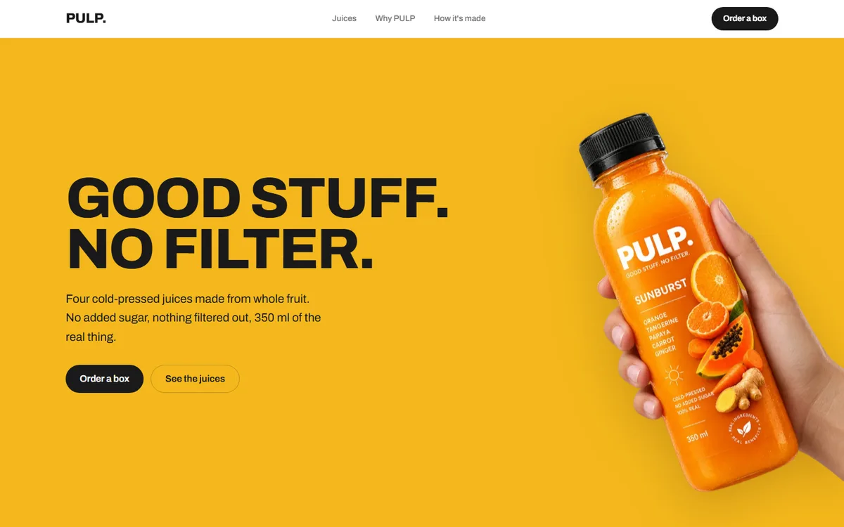
PULP
A juice brand with four flavours and no house colour. Each one takes the page over completely.
Food & drink2026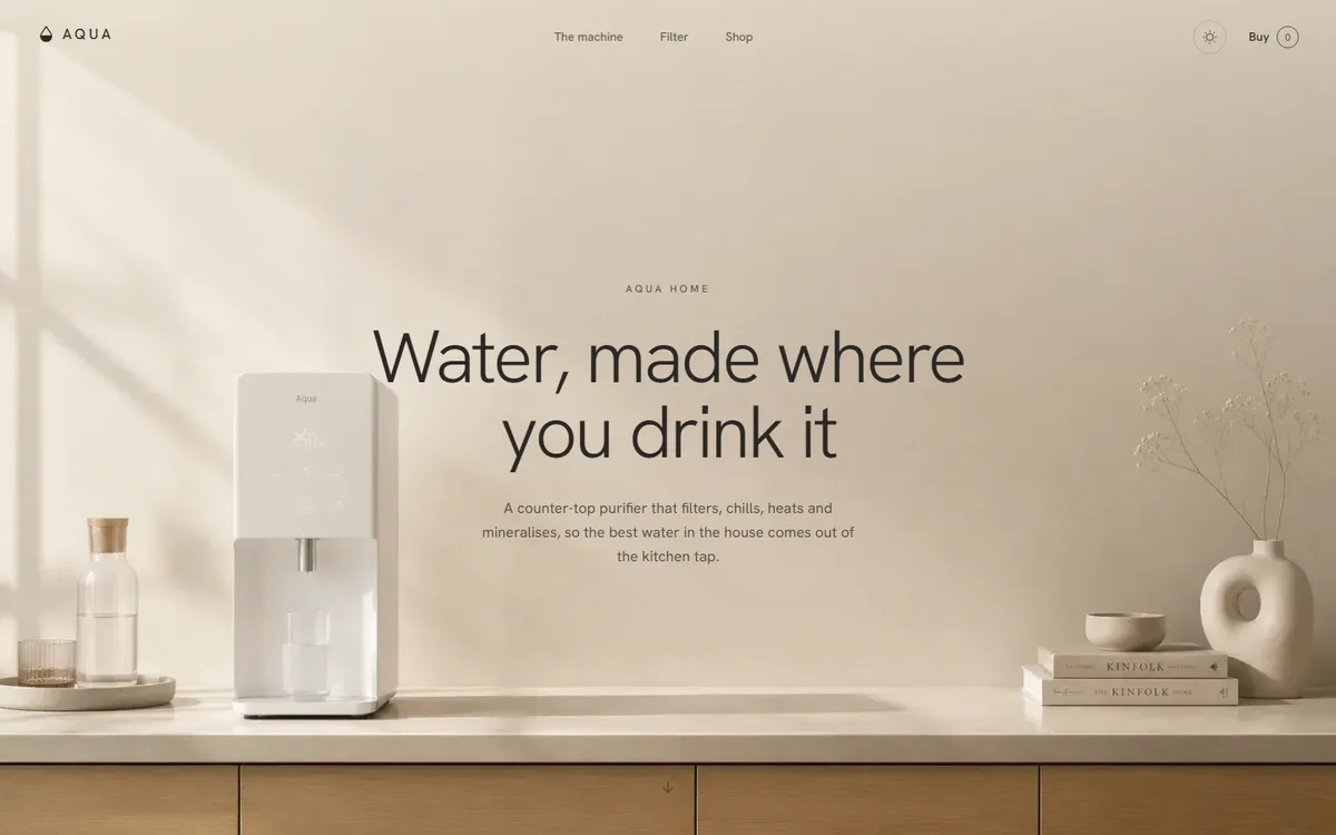
AQUA
A water product that refuses to look clinical: linen, sand and clay instead of the category's blue and chrome.
Home & appliance2026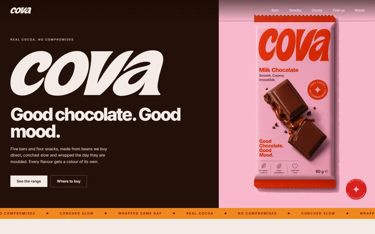
COVA
Four core browns plus a deep and soft pair per flavour, every hex sampled from the artwork rather than chosen beside it.
Food & drink2026
Start a project like this one.
Tell us what the business does and who it sells to. A fixed quote comes back inside two days.
- Office
- Sunninghill, Sandton, 2196
- Hours
- Mon–Fri, 07:00–17:00
- info@bonangtech.com