NOVA
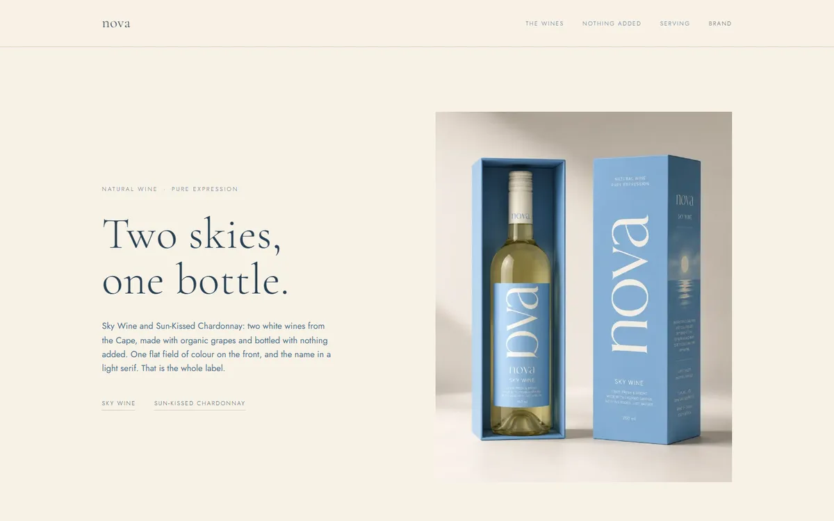
Two products is not enough to fill a website, and pretending otherwise is how wine brands end up with pages about terroir nobody reads. NOVA leans into it instead: one layout, two wines, and type doing the work photography usually does.
- Category
- Wine & spirits
- Year
- 2026
- Scope
- 3 workstreams
- Brand identity
- Typography system
- Website
- Next.js
- TypeScript
- Tailwind CSS
- Vercel
Sky and Sunlit are the entire range. The brief was a site that felt considered rather than thin, which is a typographic problem, not a content one.
The rule we set: the serif says one word, and everything else is a light sans in tracked capitals. It sounds austere written down. On the page it is what makes a two-product range feel deliberate.
Four decisions the whole project rests on.
- 01
A field is never a voice
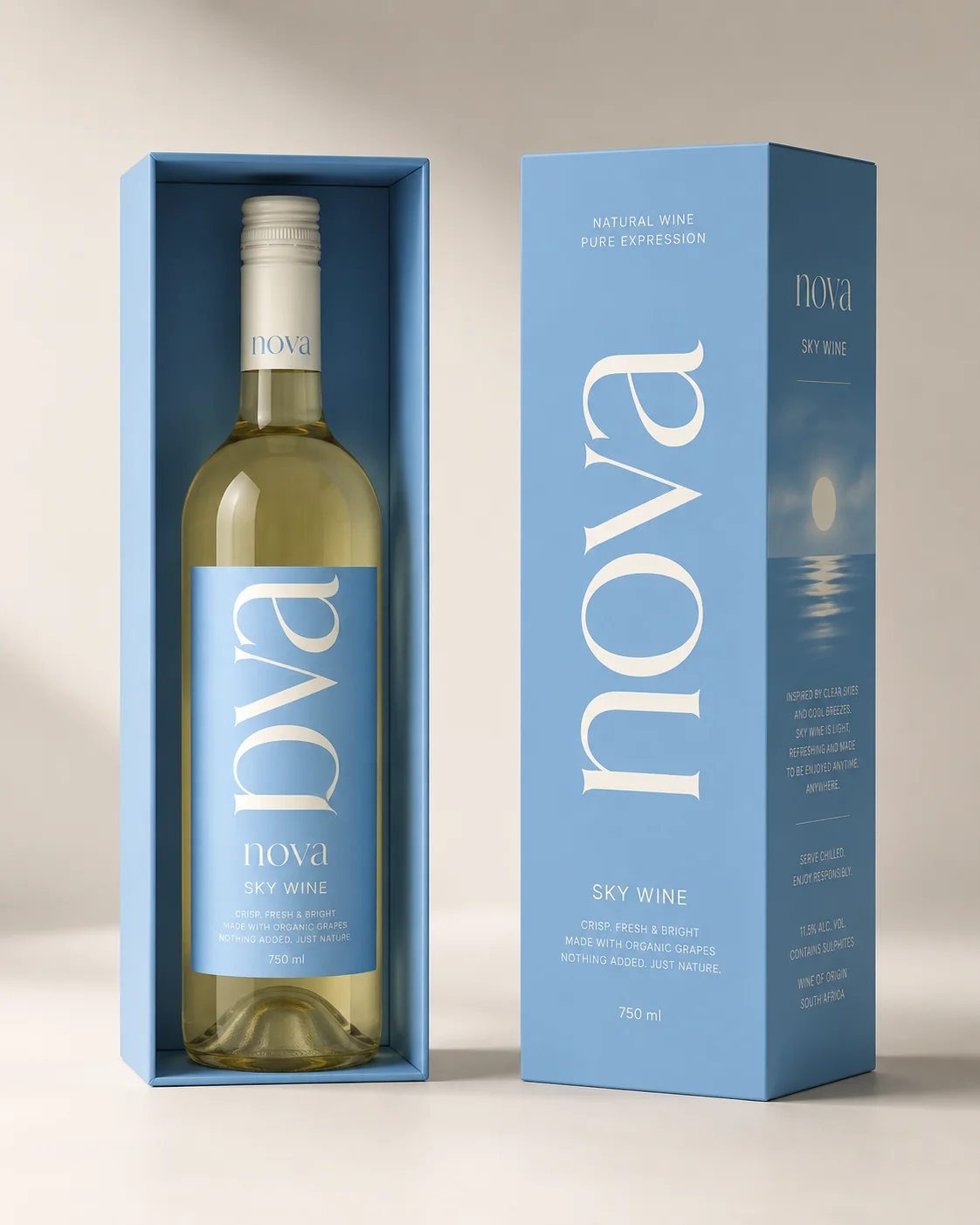
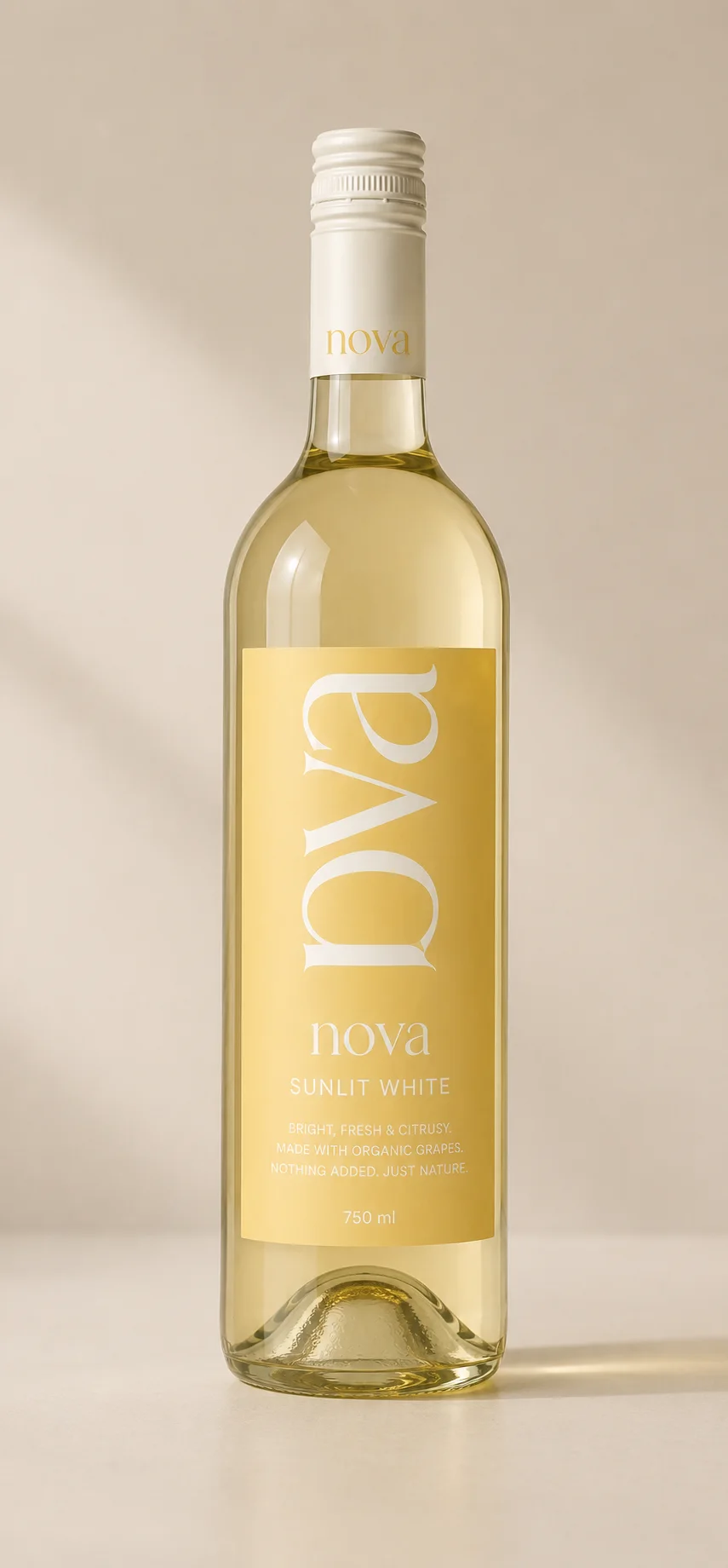
Each wine owns a flat colour, and copy on that colour always prints in Midnight. Cream on Sky measures 2.1:1, so it is licensed to the pack wordmark and nothing else.
- 02
A wordmark that is set, not drawn
Cormorant Garamond Light, lowercase, tracked +2%. Nothing about the name is a file, so it can be typeset at any size without a designer.
- 03
One dark, taken from the light
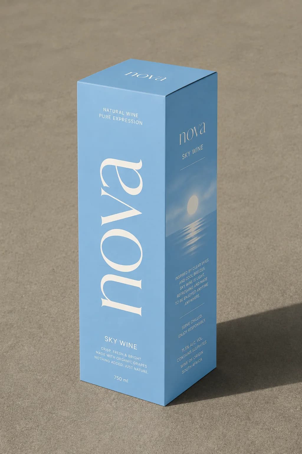
Midnight is Sky in shadow, sampled off the inside of the gift box, which is why the dark canvas belongs to the same photograph as the fields.
- 04
No client JavaScript at all
The site is entirely static. There is no state to hold, so nothing ships to the browser but markup, style and imagery.
The imagery the brand was built on.
Every frame here was produced for this project, and the colour on this page comes out of these, not the other way round.
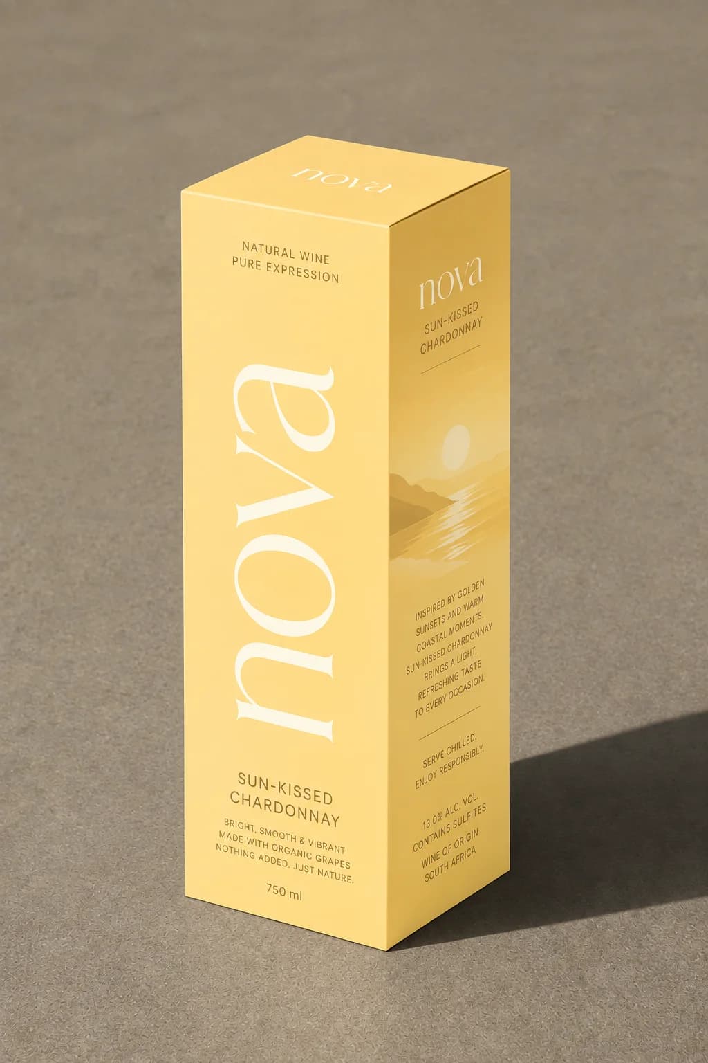
Where it landed.
A two-product range that reads as a house rather than as a starter set.
Zero client components, which is the cheapest possible thing to host and the fastest possible thing to load.
- Wines in the range
- 02
- Typefaces in the system
- 02
- Client-side JavaScript
- 0
What it taught usA rule as small as "the serif says one word" can carry an entire identity.
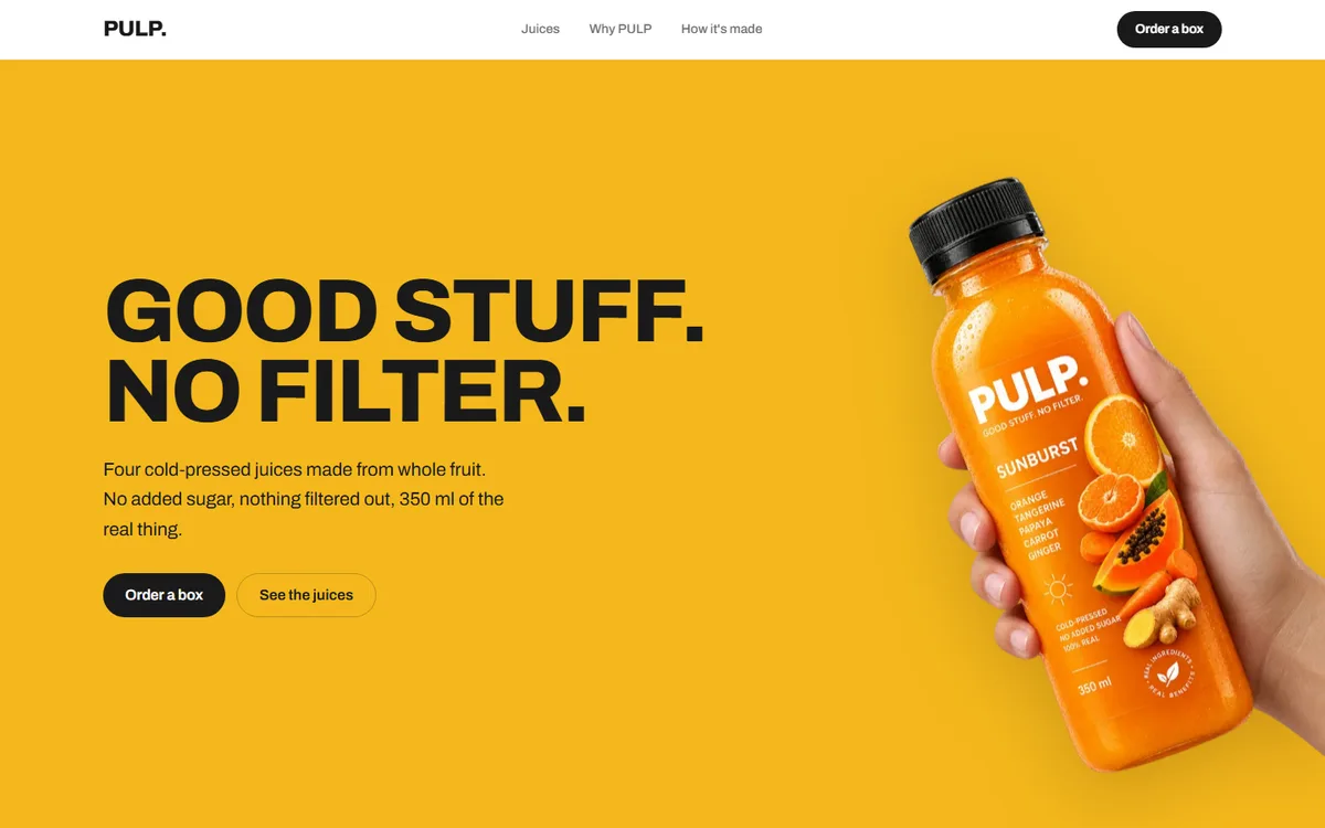
PULP
A juice brand with four flavours and no house colour. Each one takes the page over completely.
Food & drink2026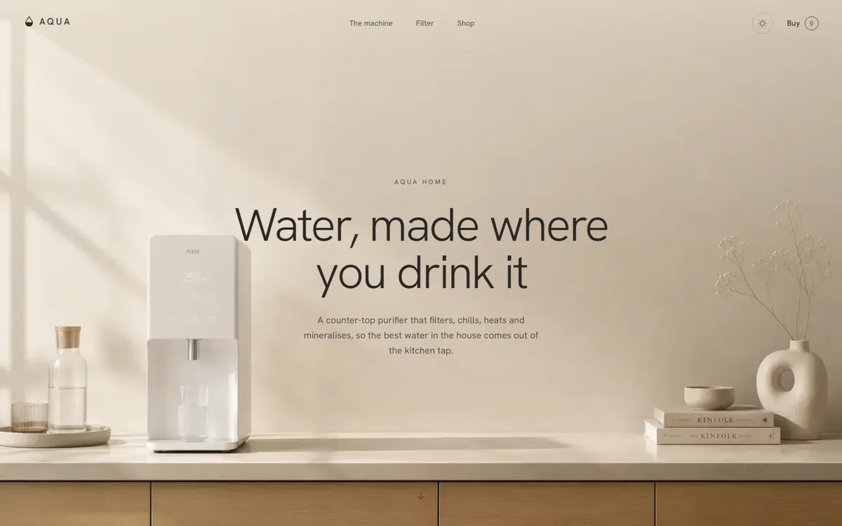
AQUA
A water product that refuses to look clinical: linen, sand and clay instead of the category's blue and chrome.
Home & appliance2026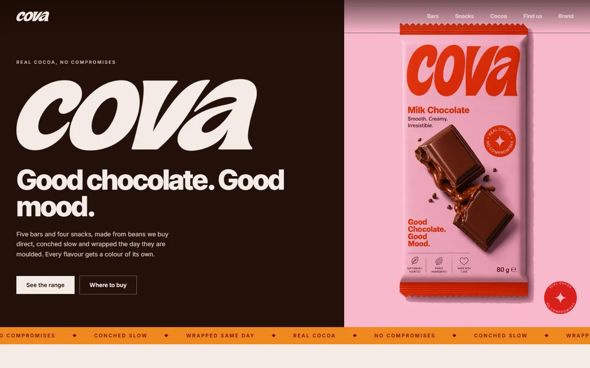
COVA
Four core browns plus a deep and soft pair per flavour, every hex sampled from the artwork rather than chosen beside it.
Food & drink2026
Start a project like this one.
Tell us what the business does and who it sells to. A fixed quote comes back inside two days.
- Office
- Sunninghill, Sandton, 2196
- Hours
- Mon–Fri, 07:00–17:00
- info@bonangtech.com